Bentley Grove {take four}
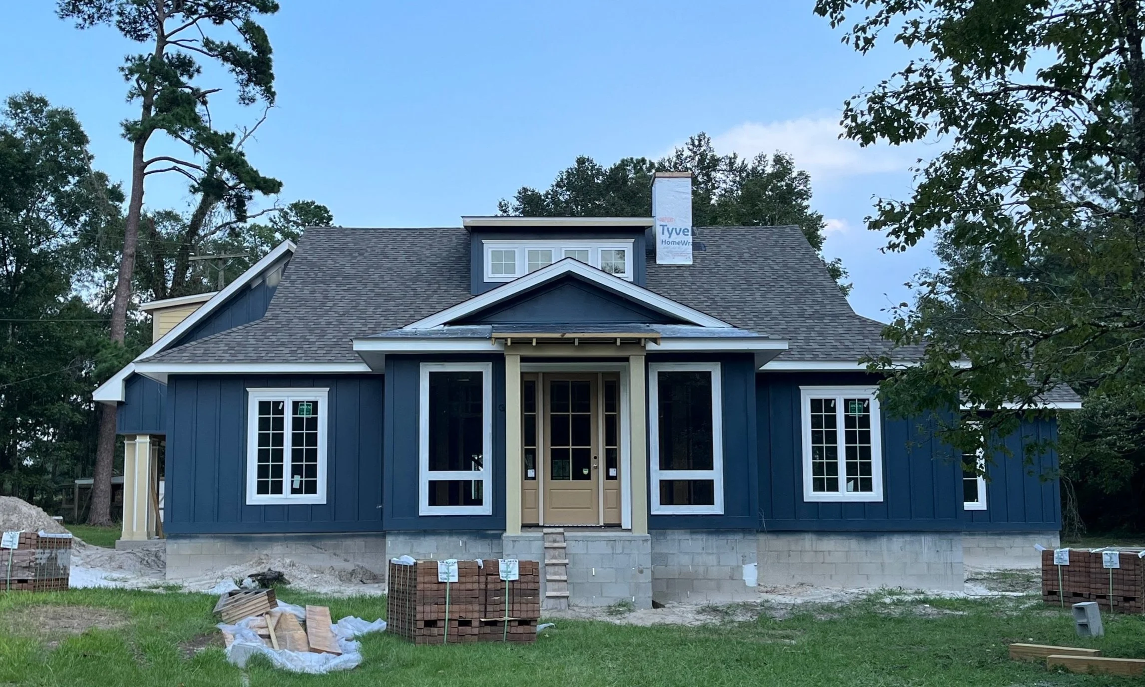
Bentley Grove is finally starting to look like a real house! The biggest change is the outside is finally getting some color! As I mentioned in my last post, I was really struggling with picking the right shade of blue. We landed on Sea Serpent by Sherwin Williams and I love the way it turned out. In addition to the poster boards samples, I also painted a large section on the actual house. The day I came home and they were spraying the color on, I had a slight panic attack as it looked so purple. But after it dried, it was exactly what we were hoping for! We love the contrast of the dark blue against the white windows.
The shingles were installed last week and brick is starting any day now. Thankfully, those decisions weren’t as hard as the paint. I went to our local showroom and found five bricks I liked. After looking at online photos, we narrowed it down to two - Old Jackson and Old Guignard by US Brick. We got a few addresses to see what they looked liked installed with different mortar colors and that helped seal the deal! The winner was Old Guignard with lite buff mortar. I can’t wait to see it done as it will truly finish off our exterior design.
Now that the outside is settled, it’s time to focus on the inside. I like to work on cabinets, countertops and tile at the same time since that gives me an overall vision of the bathroom. This also goes for the kitchen. Today, I’m going to walk you through my initial design plan for the master bathroom.
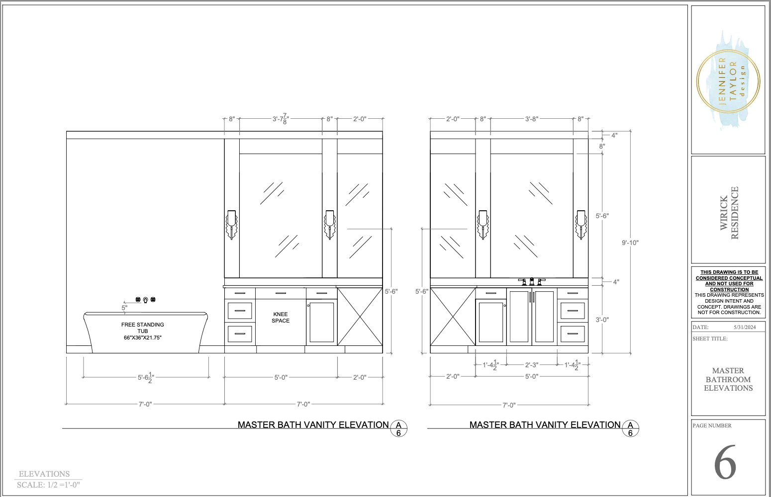
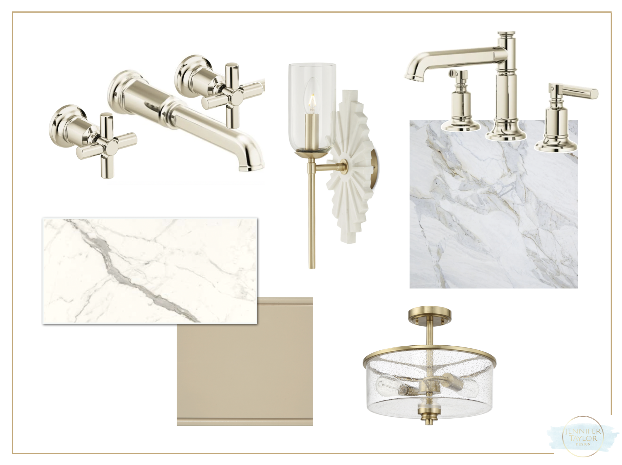
I started with the plumbing since that is one of the first selections to be finalized when you’re building a home. I selected the Invari collection by Brizo because I needed a wall-mount tub filler that didn’t feel too traditional and I liked being able to mix the handles. Then came the cabinetry design. I went with an L-shaped layout to save some space, so symmetry was important. I also decided to forgo a second sink and create a knee space. The plumbing is inside the wall in case we ever change our mind, but having a dedicated spot to get ready in the morning was more important than another sink. We are also doing an insert in the blind corner cabinet to maximize space.
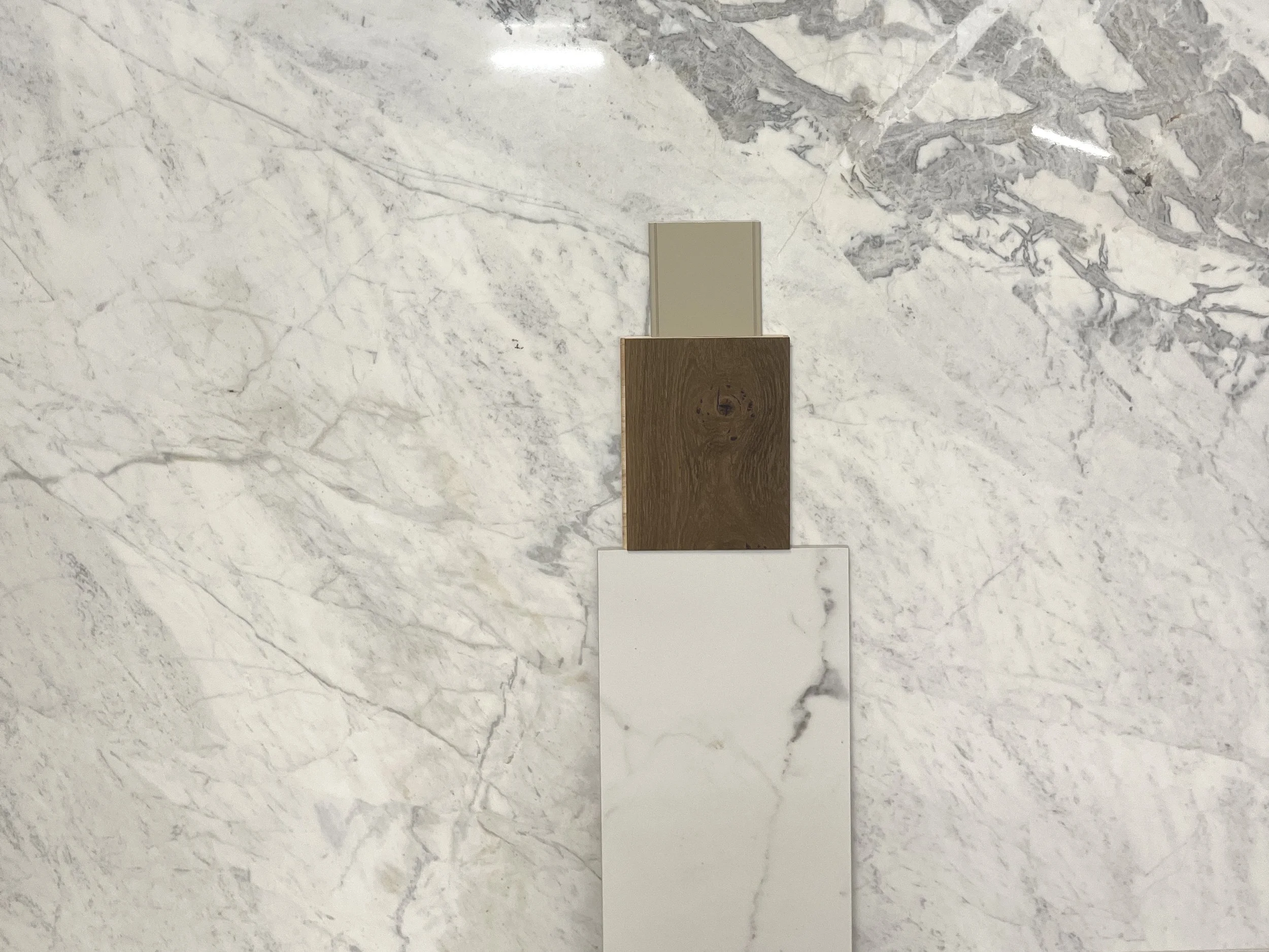
Back in April I found a porcelain tile that was looked like natural marble. The veining was very pretty but it has a lot of variation so I didn’t want to use too much of it. My plan is to use it only on the shower walls, but I’ve been struggling to find something for the bathroom floors. So, I think we’re going to bring the wood into the bathroom. I know it’s unconventional, but I trust we won’t leave water on the floor and rugs will keep it protected. Am I crazy?
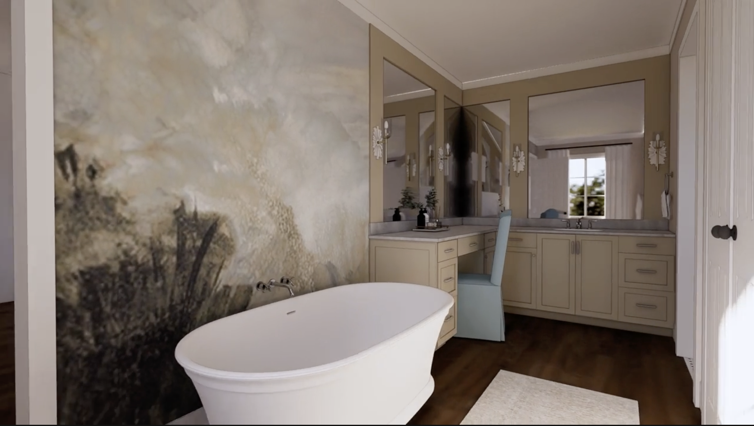
Another unexpected thing I considered was a wallpaper mural behind my freestanding tub. I need something to give that large wall some interest, but not compete with my cabinetry on the other side. Once I saw this idea in my 3D rendering, I decided to pivot and do something totally different. It felt too busy and most of the design was hidden behind the tub. Thank goodness for renderings! Check out the video at the end of this post to see my new plan, which I like much better.
I thought selecting the counter would be hard as I really didn’t know what I wanted, but I found the perfect one at my first visit to the stone yard. It’s called Matarazzo, which is a natural stone called dolomite. It works really great with the shower tile and my cabinet color, which is a light tan. I also love it with the wood flooring.
My last big decision for this bathroom is the shower floor tile. I want to bring in a touch of black, but not too much. I’m also considering using the same time on floor of the toilet room with some type of border. I found a basketweave that looks great with the wall tile, but I’m still looking.
Here’s a complete list of all the decisions I have to make for this one bathroom:
Plumbing Fixtures - sink faucet, tub filler, shower valves, tub and toilet
Cabinet Design - color, door style, layout and hardware
Lighting - vanity, ceiling and toilet room
Flooring
Shower Wall and Floor Tile - selection, grout color and layout
Countertop - details on splash and edge
Wall Treatment - wallpaper, paint colors and paneling detail
Mirrors
Bath Accessories
Window Treatments
Vanity Stool and Art
And this doesn’t include all the time I spent getting the floor plan just right, as well as the location of the lighting, plugs and switches. This is why hiring an interior designer to handle all of this for you is a smart decision. Not only do we help you make ALL of these decisions, but we communicate those decisions to your contractor and trades with drawings and spec sheets. Plus, we can put your design plan into a 3D rendering so you can be 100% confident in your decisions.
Here is the final rendering video with the changes I made, after seeing the wallpaper mural. I love the soft blue paint on the walls and the paneling gives me some interest on the wall that works with my cabinets, not against. I plan to find the perfect wallpaper for the toilet room.
Thanks for Reading!
Jennifer

