Nip and Tuck
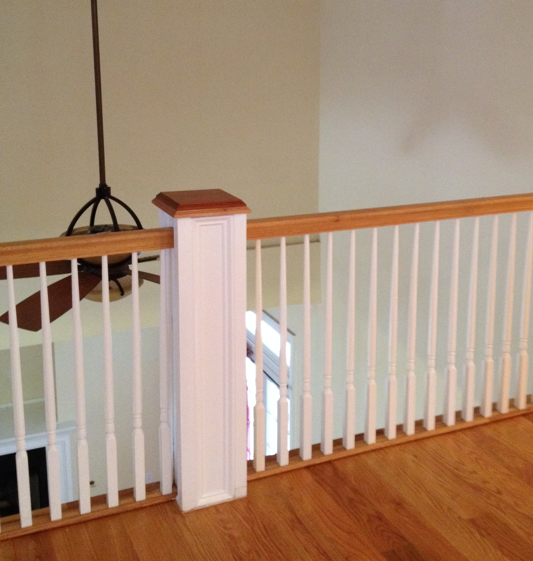
My Appleton project can best be described as a house that just needed a little nip and tuck. It was a great house, but just wasn't my client's style. They brought me in at the very beginning and we made a plan! This included paint colors, lighting changes, a new bathroom, kitchen updates and some much needed personality. The biggest structural change was closing in a portion of the ceiling in the family room. It was open to the second floor and was a total waste of space. I also saw a ton of potential on the fireplace wall and had to close in that opening as well.

What a difference, right? We closed in the ceiling, added trim and gave the fireplace wall A LOT of personality! Oh, but wait. Let's look at the kitchen. It got some design love as well. The island was small and not functional; so we replaced it, painted all the cabinets, replaced the counters and added the best tile on the splash. The tin behind the stove just wasn't working for us.
I don't know what I love more about this project. My clients were a dream to work with and I can't wait for them to get all moved in. I also can't wait to share more with you once I take some final photos.


