Stop Making These Mistakes in Your Bathroom
A few weeks ago, we had our Parade of Homes and I took a quick peak of what some of our local contractors are putting out there. Let’s just say that those home tours inspired this blog post!
Designing a bathroom takes a lot of work and most of that is the “planning” stage. There’s so much to think about and those details can make or break a bathroom design.
DON’T SKIMP ON THE MIRRORS
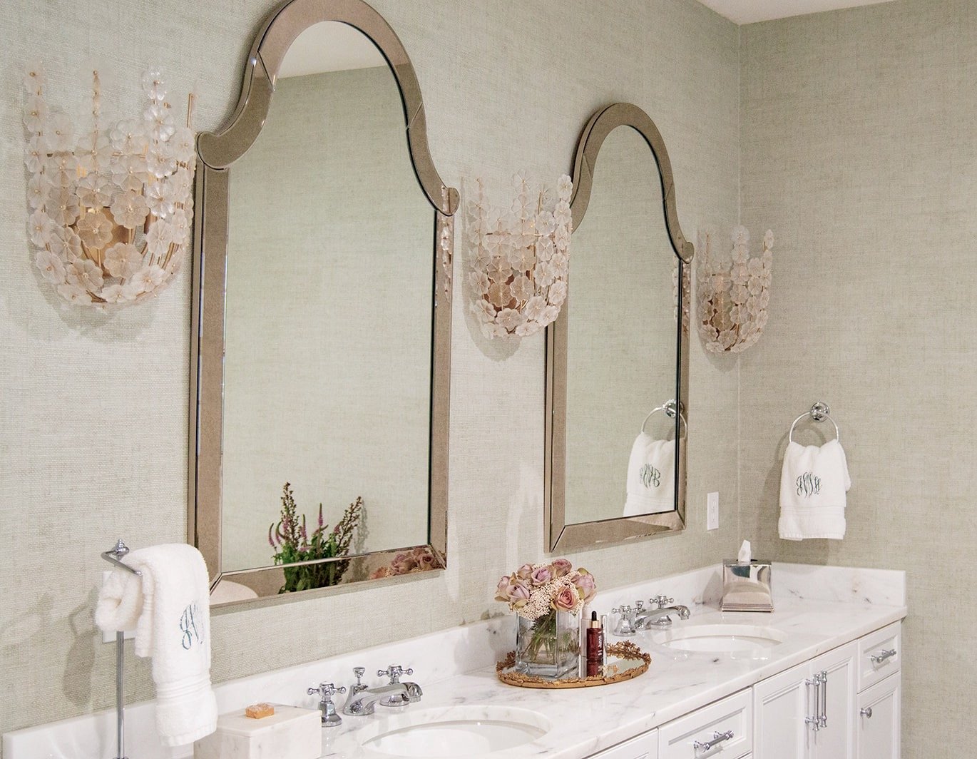
If you plan on using decorative mirrors, it’s best if you can select those at the same time as everything else. This way you can make sure your lighting is installed at the correct height and you have adequate spacing for the size mirror you need. I saw so many mirrors that were way too small for the space they had to work with and I’m sure that’s because they were rushed to find a mirror that would be “good enough”.
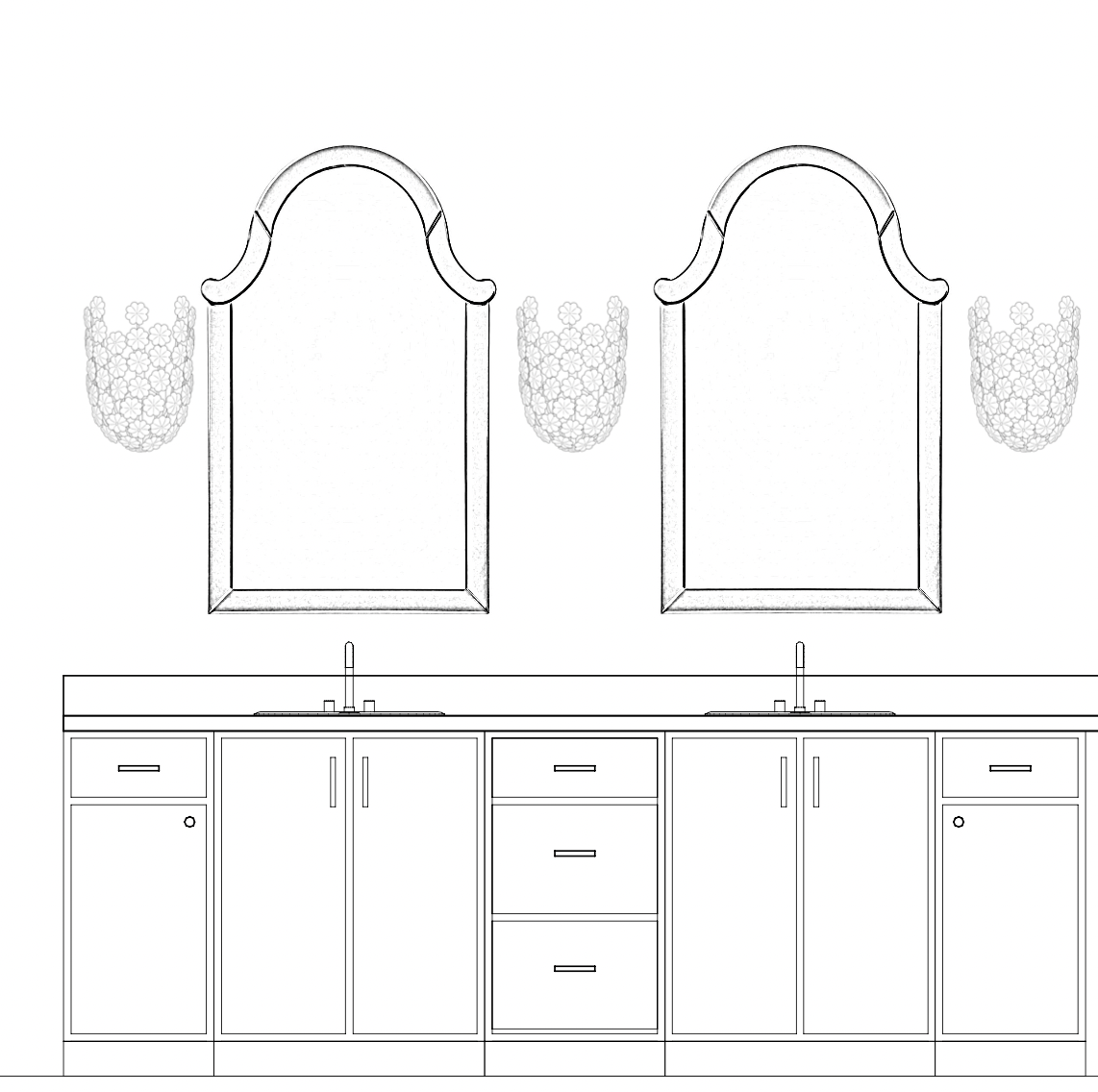
In my bathroom, I selected both my mirrors and light fixtures before we began the renovation as the spacing was so important to me. Having a drawing, with measurements, was all my electrician needed to get my lights in the right place.
KEEP THE TUB
If you have the room, I highly recommend you keep a tub in your master bathroom. Freestanding tubs take up less space than the ones that require a tiled tub deck. I added a tub when I remodeled my bathroom and it was the BEST decision I made. I know a lot of you feel like tubs are a waste of money, but think about resale. According to the National Homebuilder’s Association, 74% of home buyers want both a shower and tub in the master bath.
I see a lot of remodeled bathrooms where they remove the tub and create an enormous shower space. In my opinion, showers don’t need to be larger than 5’ x 4’. That size will easily accommodate two shower heads and a bench. If you feel strongly about not having a tub, then give the extra space to your cabinets. You can never have too much storage in a bathroom!
LESS IS MORE
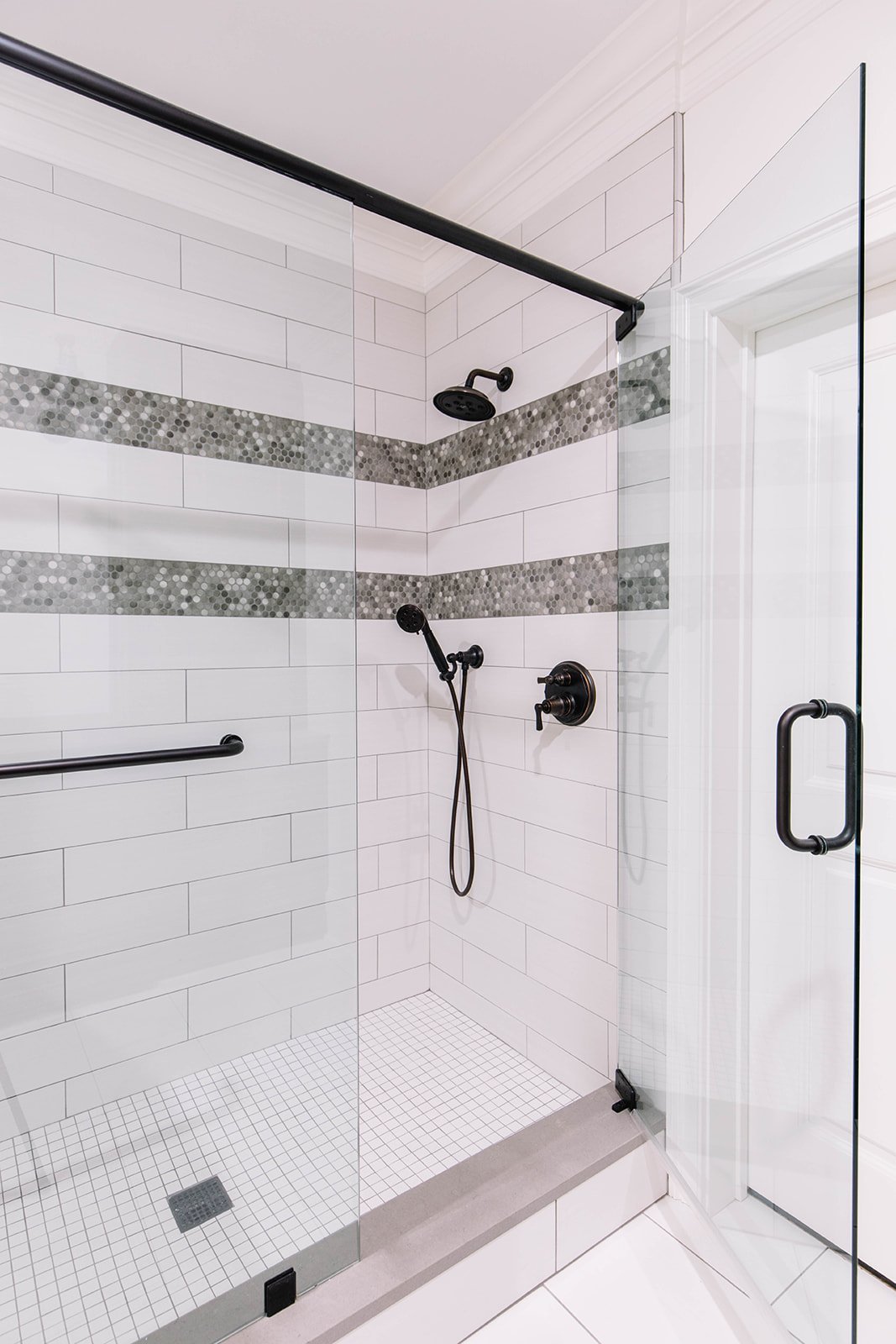
When designing a bathroom, I prefer to keep the main tiles more neutral and find one thing that is the “star of the show”. That can be an accent tile, countertop or even a light fixture, but not all three. In the bathroom below, I wanted the penny round tile to be the focal point so I designed a double border design in the shower, then kept everything else simple and white.
Sometimes we find many things we love and want to use all together, but that can create a bathroom that is busy and feels chaotic. Remember less is more!
PLACE FOR ALL YOUR STUFF
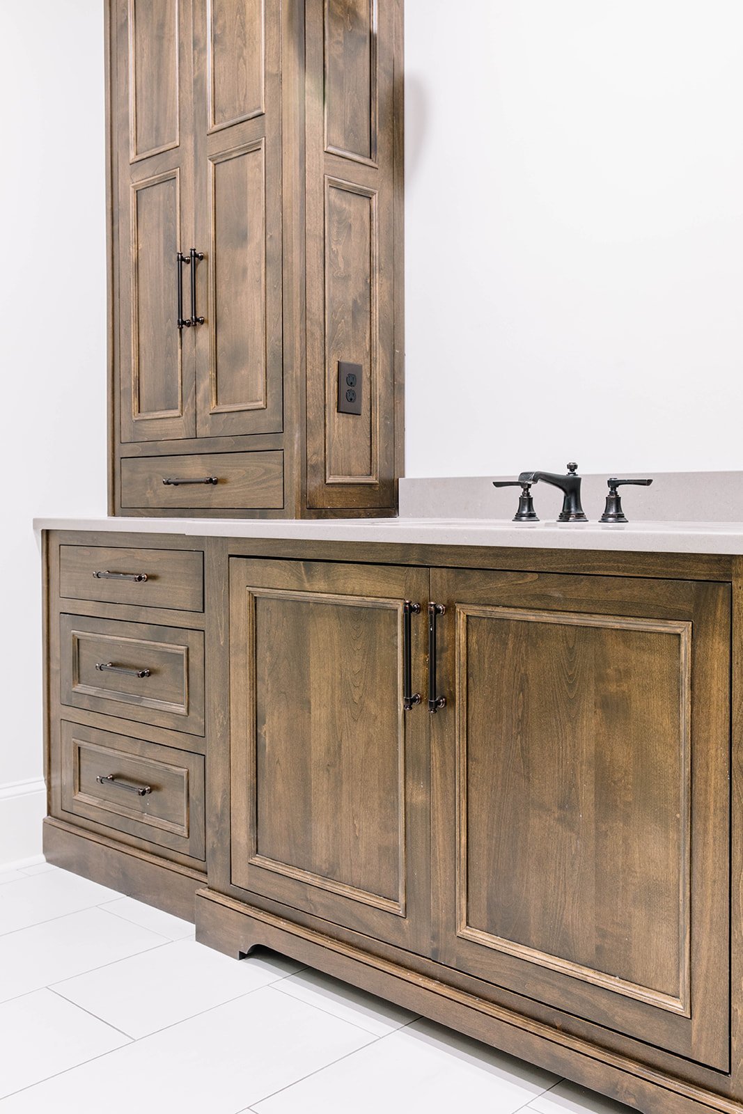
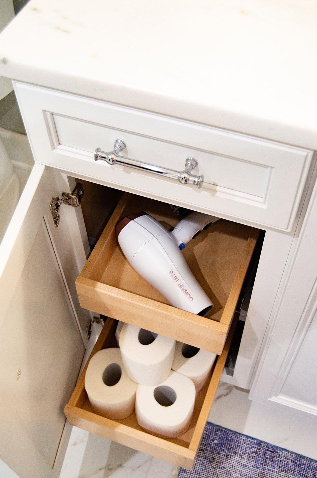
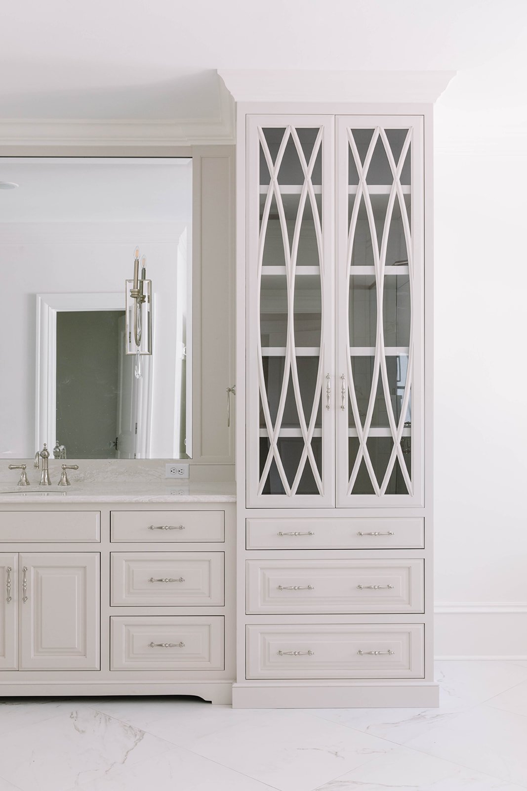
Planning for where you are going to store all that you need to start and end your day is so important. In your cabinets, I highly recommend adding pull-out shelves so you can utilize every inch of space. I love these drawer inserts to help create “zones” inside of your drawers. If you have a linen close with a door, consider eliminating that and use the space to design a storage cabinet. In addition to towels you can store sheets, extra bottles of shampoo and even clothing.
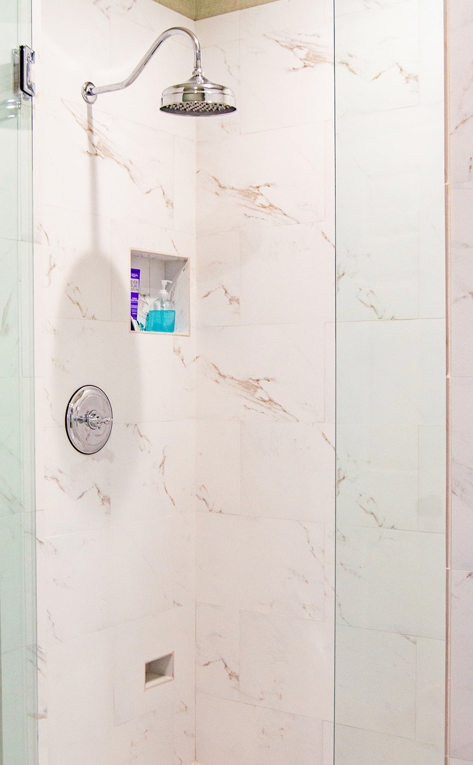
Don’t forget what you use in the shower every day. I like to incorporate recessed niches vs. installing shower caddies. It’s cleaner and feels less cluttered, but it does require some planning. I have two niches in my shower and I’m able to store 8 products with a little room to spare. I also added a small toe niche that I use for shaving.
If you are planning a bathroom renovation, then you need to check out my online course “How to Renovate Your Bathroom Like a Pro” where I walk you through each step for a successful renovation. We cover planning, budgeting, selections, schedules and everything in between!
Thanks for Reading!
Jennifer

