Oh, no you didn't!
So many design blogs post all of these beautiful photos of wonderfully designed spaces, so I thought I would do something a little different and show my readers what NOT to do when it comes to interior design. It was also super fun finding photos to reflect these great design faux pas!
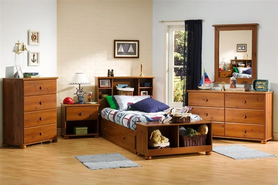
~Matching Sets~This is a really easy trap to fall into, especially when you are designing a space with all new pieces. You walk into a furniture showroom and the room setting looks amazing, already put together, everything matches...I'll take it! No muss, no fuss and no design! It definitely takes more effort to not match your furniture, but this is where a designer is so important. We can help you put together items that are similar in scale, quality, color, etc. but not pick everything from the same manufacturer. This way your room has more personality, it is a reflection of you and not the furniture store or catalog.
~Painting First~If you are going to paint a room and also plan on replacing other things, then select the paint color last. There are literally millions of paint colors and it's far easier to match a paint color to a rug or bedding set than the other way around. When I design a room, paint colors are literally the last thing I finalize. I will say that I have an idea of what color we are going to use - blue, green, neutral, etc. but I definitely don't have an exact color that I'm carrying around trying to match a fabric to. I'm also a huge fan of putting a paint sample on the wall first. Whether you actually put it on the wall or on a posterboard, get a sample. It's so worth the $7.00 investment...
~Trends~I'm a big believer in classic design and not getting too caught up into what is hot at the moment. When you can walk into a room and not be sure what decade it was designed in, I think you are successful. Trends are great as accents, but don't ever invest in a trend. It's much harder to part with something you spent on a fortune on. Changing out pillows, reupholstering a chair or replacing a light fixture is a lot less expensive than replacing an entire sectional sofa. I like bringing in trendy items through small things like pillows or accessories, just don't over do it.
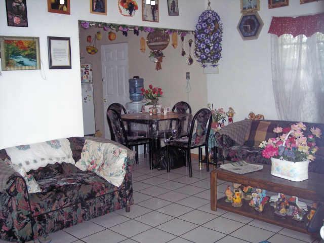
~Too Many Accessories~Having too many accessories is an easy trap for most of us to fall into, especially with stores like TJ Maxx, Marshall's and Hobby Lobby. How can anyone resist a beautiful vase for $9.99? The problem is, when you purchase a little something each time you visit one of these stores, your room can be overwhelmed with too many tchotchkes (a small object that is decorative rather than strictly functional; a trinket). I have always wondered how to spell that. :)
My advice, buy fewer, larger items. Invest in a few large accessories, versus having a hundred picture frames filling up your tabletops. Same goes for art. There is no need to fill every inch of wall space. Create "breathing room" around your decorative items so that you can appreciate and enjoy them. Don't do this...
~Hanging Art~This is another common mistake people make, especially when men hang the art in a room. It's too high! A good rule of thumb is the center of your art should be about 60" above the floor, but this is just a guideline. Eye level is always more pleasing, but sometimes in a room with higher ceilings, you need to go a little higher or if you have a pair of prints, you may need to go a little lower. When you hang art over a mantle or piece of furniture, only allow about 6" to 12" of space between the two items. They need to appear to work together. Here is a great example of art being hung way too high...
Please understand that these photos represent extremes and are just my attempt at design humor. If you ever have a question about your space or before you commit a "design don't", please send me an email. It's amazing what kind of design work can be done via email with photos and a scanner. I can be reached at JHillTaylor@gmail.com and I look forward from hearing from you.


