My Favorite Bathroom Lights
We’ve been designing a lot of bathrooms lately and one of my favorite elements is the lighting. I like to keep my designs pretty classic and traditional but tend to push the envelope a little with the lighting. I encourage my clients to do this because it’s one of the simplest things to change later and it can give your bathroom so much personality!
I’ve also been sourcing lighting for my own bathroom renovation and I’m having such a hard time deciding. I’ve considered doing two traditional vanity lights above each sink, but then I love the idea of using three wall sconces. Then there’s the option of doing pendant lights on each end! My Pinterest board is filled with options and I’ll have to make a final decision soon.
In the meantime, I thought I would share some of my favorite lights with you in case you were considering doing some changes in your bathroom. Each one is linked from some of my favorite sources, so if you don’t like these - check out the websites for tons of other options.
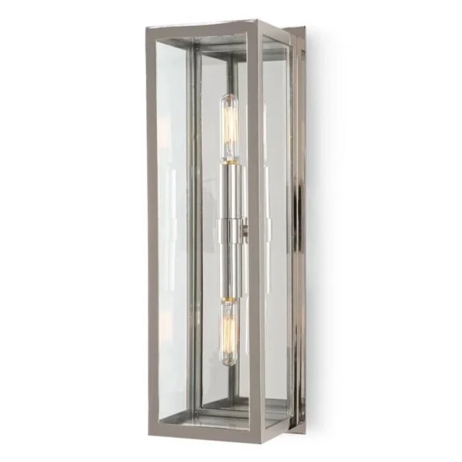
The Ritz Sconce by Regina Andrew is a great option when you don’t have a lot of space. It comes in three popular finishes - polished nickel, natural brass and oil rubbed bronze. I love the clean lines and how it can work in a traditional or more modern bathroom.
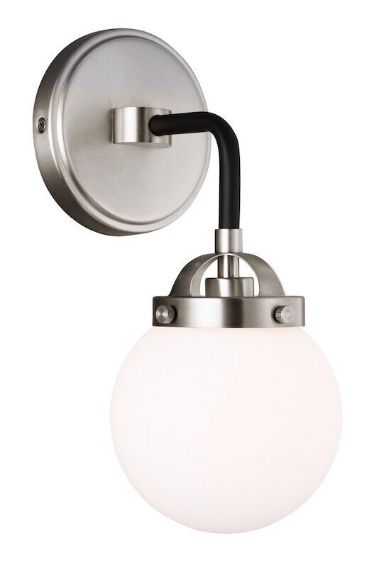
The Cafe Sconce by Generation Lighting is a great looking option at a very good price. It also comes in multiple finishes and sizes - from a single wall light to one with five. This light would be great in a powder bath or a kid’s bathroom. I love the touch of black! Maybe mix this light with a black faucet?
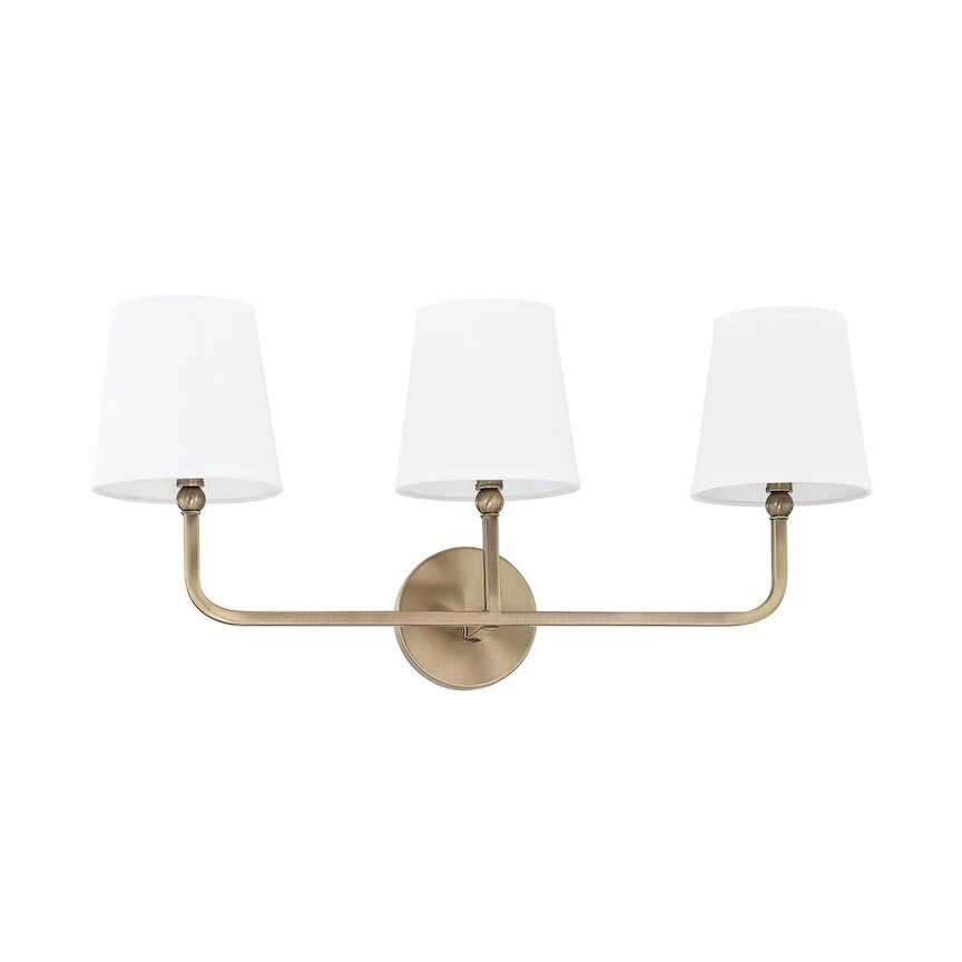
Dawson Wall Light by Capital is a great option if you want to bring a little bit of brass into your bathroom. I like mixing metals so don’t be afraid of putting a brass light with a polished nickel faucet. This collection also comes in multiple finishes and sizes. And you can’t beat it for under $200!
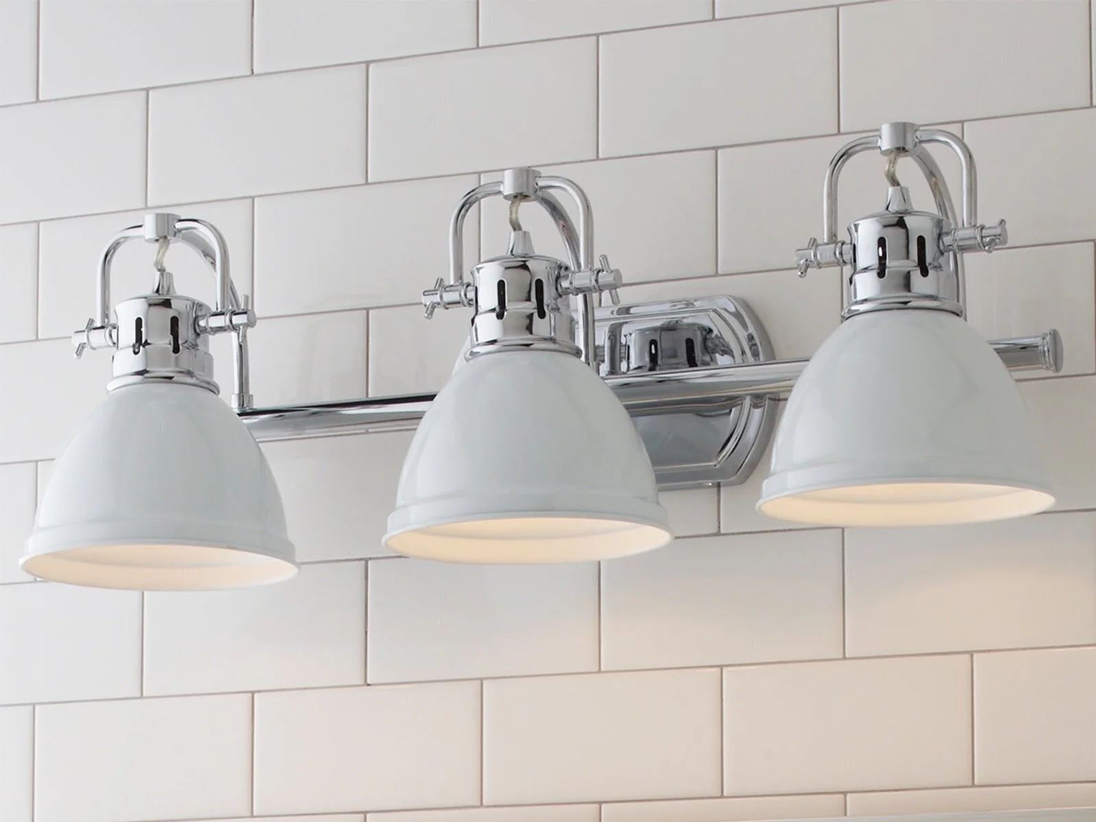
Classic Dome Shade by Shades of Light is the perfect option if you want that “modern farmhouse” look in your home. This design comes in 22 combination of finishes including seafoam green. I really like the industrial feel of the metal shades.
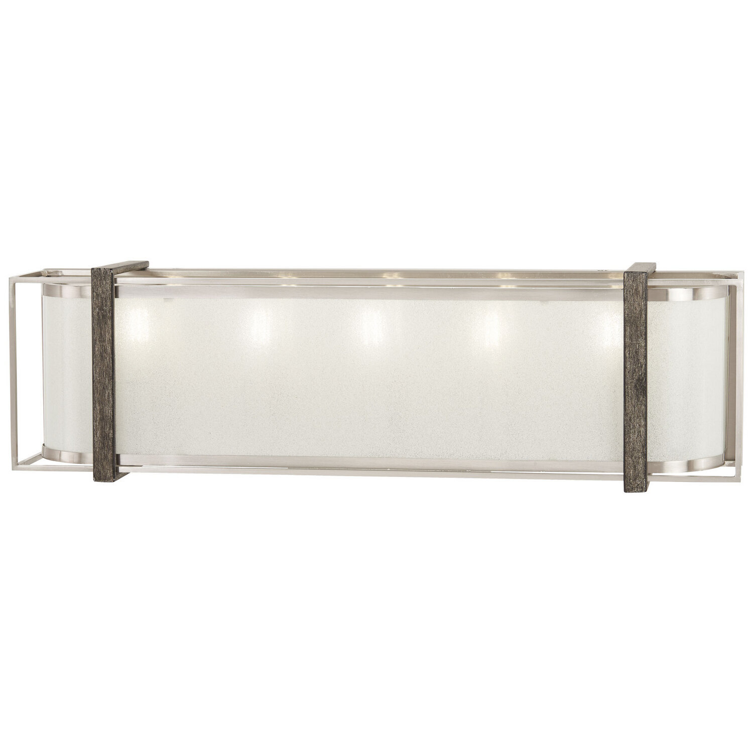
Tyson’s Gate Wall Light by Minka-Lavery is perfect for those who want something more contemporary for their bathroom. This light comes in three lengths and I love the mix of brushed nickel, with the other finishes. Pair this with a sleek, brushed nickel faucet to really update your bathroom.
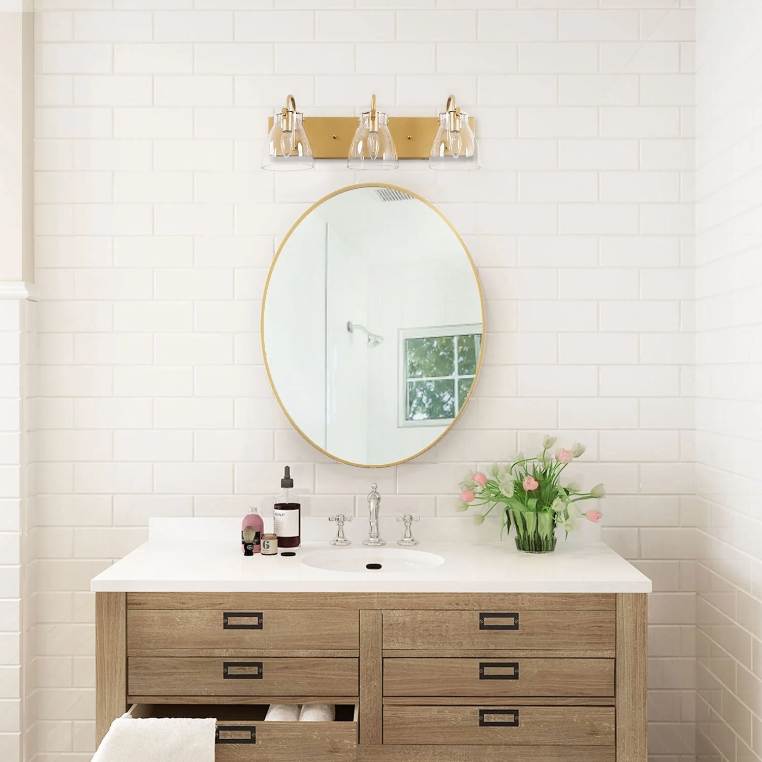
Here are a few other thoughts I want to share on bathroom lighting. Bigger is better! Don’t skimp on the size of your light if you have a wall light mounted above your mirror. If your vanity is 36” wide, then your light shouldn’t be any smaller than 24”. Proportion is important. Below is an example of a light that is TOO SMALL for the vanity below. The light is pretty, but should have been much wider or wall sconces would work well to fill in that empty space on each side of the mirror - which is also way too small for this vanity size.
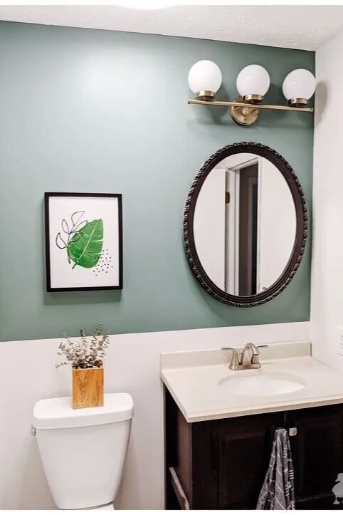
Another common mistake is I see with wall lights is mounting a fixture where the light is shining up, instead of down. Lighting in a bathroom is important, so why would you want it directed at the ceiling? There are a lot of things I find wrong with the photo below, but just focus on the light. It needs to be flipped so the light is shining down.
I’d love to hear your lighting questions in the comments below.
Thanks for Reading!
Jennifer

