Milestone {final look, part two}
In my last blog post, I shared the dining room, study and master bathroom photos from my Milestone project and today I’m posting the rest. If you missed that post, I highly recommend you take a few minutes to read the background on this great house and to see the yummy photos. I promise, it’s worth it!
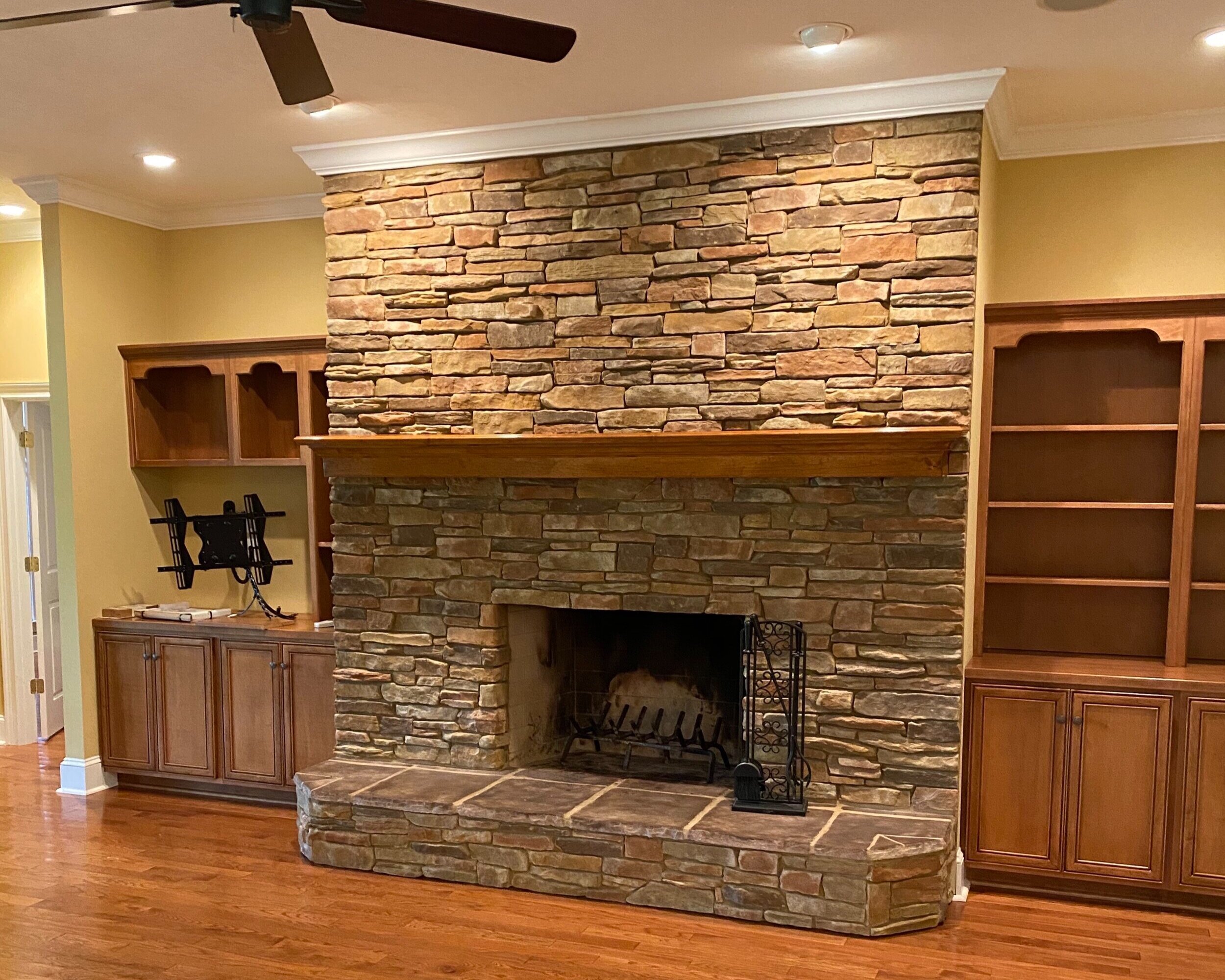
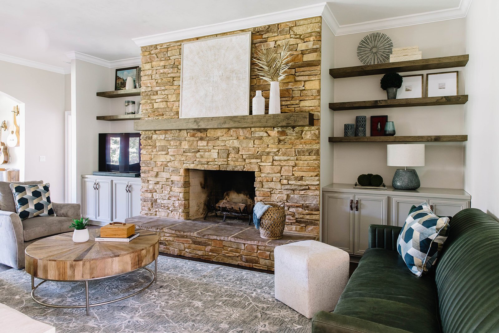
The family room felt VERY dated when I first saw it and hoped we were going to lose the stone fireplace, but I was wrong. The clients really liked it and so I made the best of it. Changing the paint and wood floor color were first priority and doing that made the stone look 100% better. Then, I had to tackle the built-ins which felt dwarfed next to the fireplace.
To keep the budget in check, we kept the existing base cabinets. I chose a color that was a few shades darker than the wall and added some leather pulls. We removed the upper bookcases and replaced them with floating shelves. The television stayed on the left side and extends so it can be seen from every seat in the family room..
Speaking of seats, do you see that beautiful green, leather sofa? I’m so glad the clients trusted me on this as it’s an amazing addition to the room. On the other side, we balanced it with a pair of swivel chairs and a fabric sofa.
Between the family room and the screened porch is a room that steps down with brick floors. The previous homeowners left a piano, so we decided to keep it and turn the space into a music room. Thankfully, my client had a great guitar collection which gave us a fun feature wall.
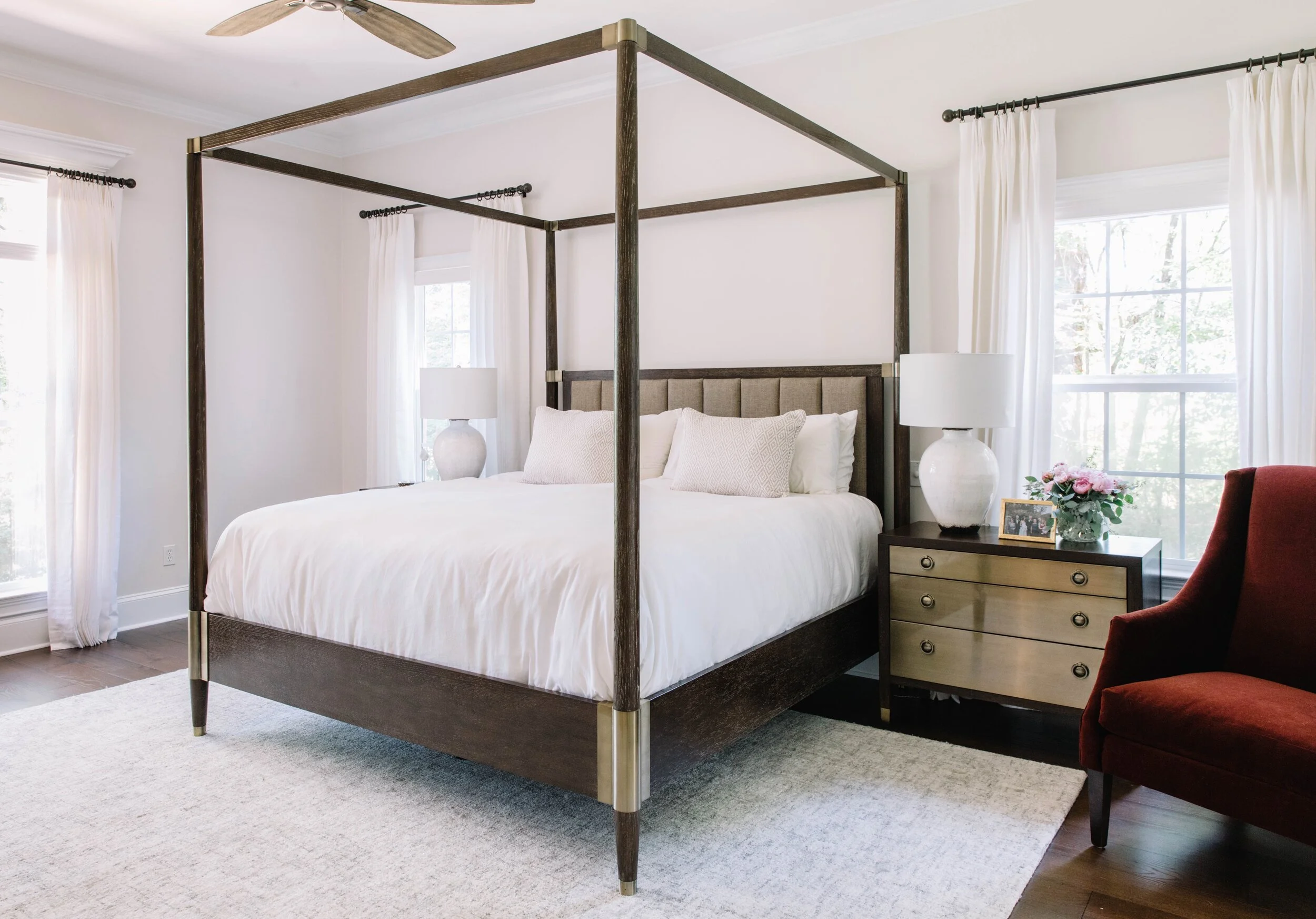
We totally transformed the master bedroom. My clients requested a calming room with very little color. This meant the furniture had to be great. I don’t know what I love more, the canopy bed with the upholstered headboard or the metal front drawers on the night stands.
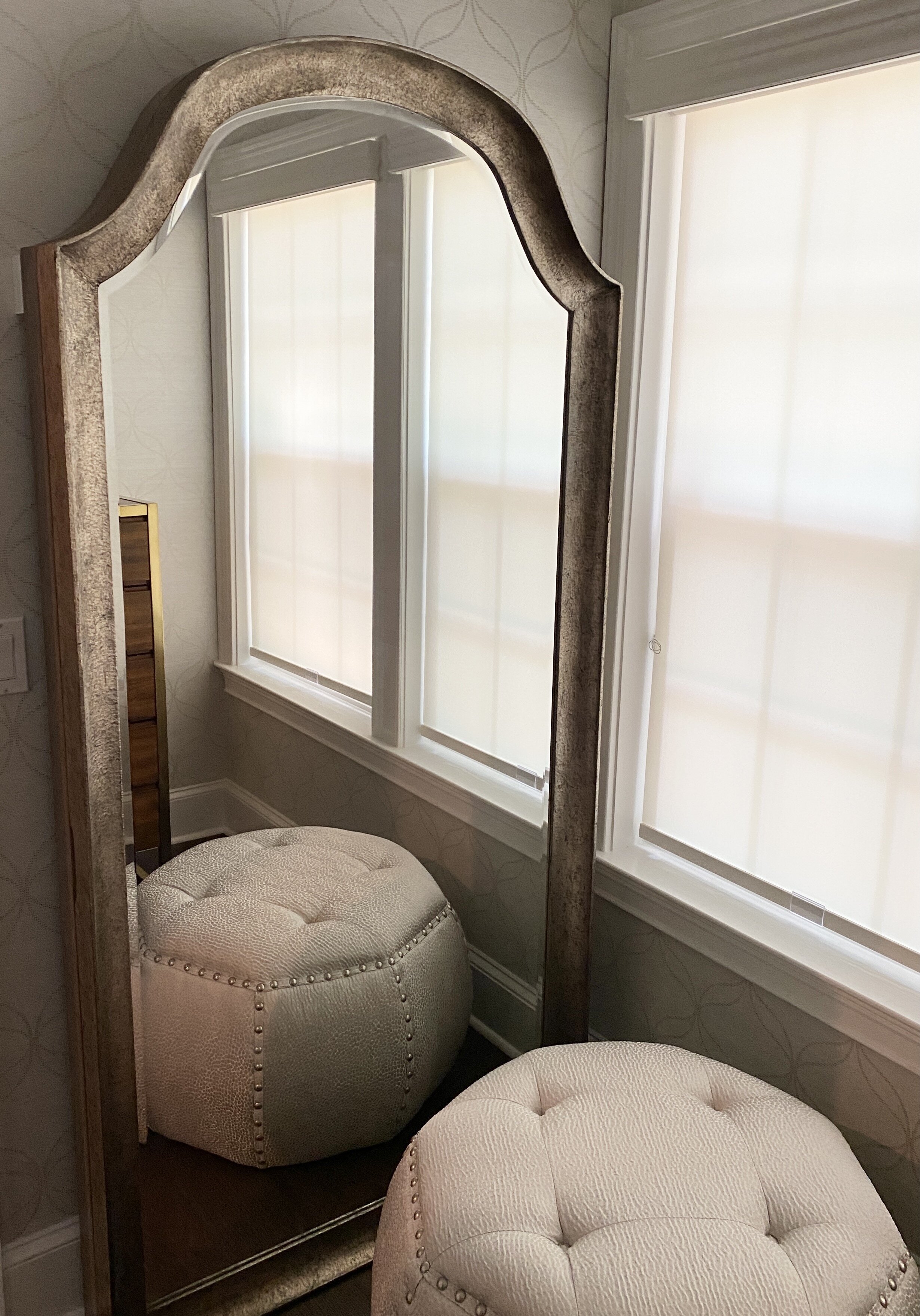
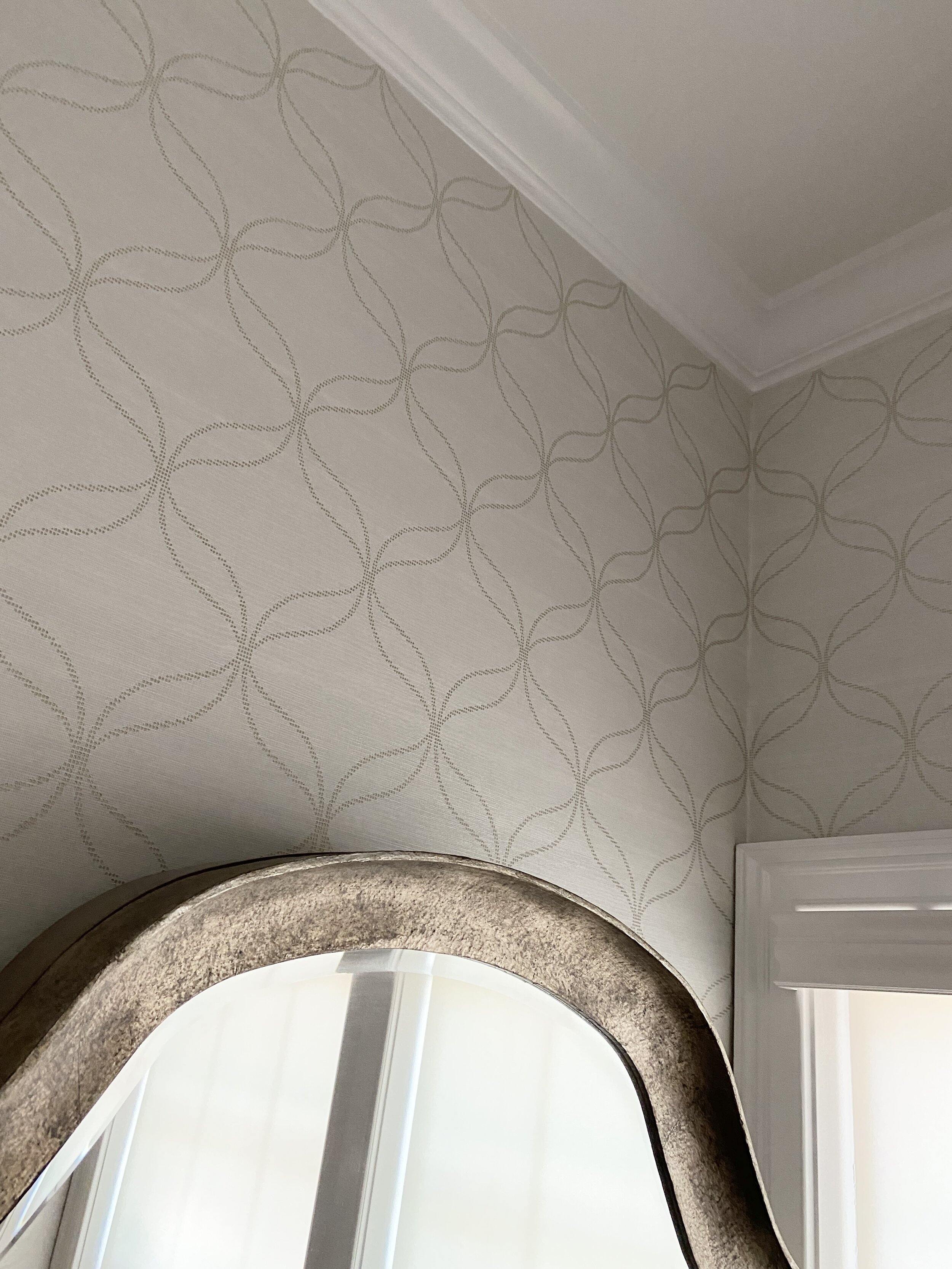
Between the bedroom, bathroom and closet is a small room we weren’t sure what to do with. We created a little dressing room that includes a floor mirror and an ottoman, with the perfect wallpaper.
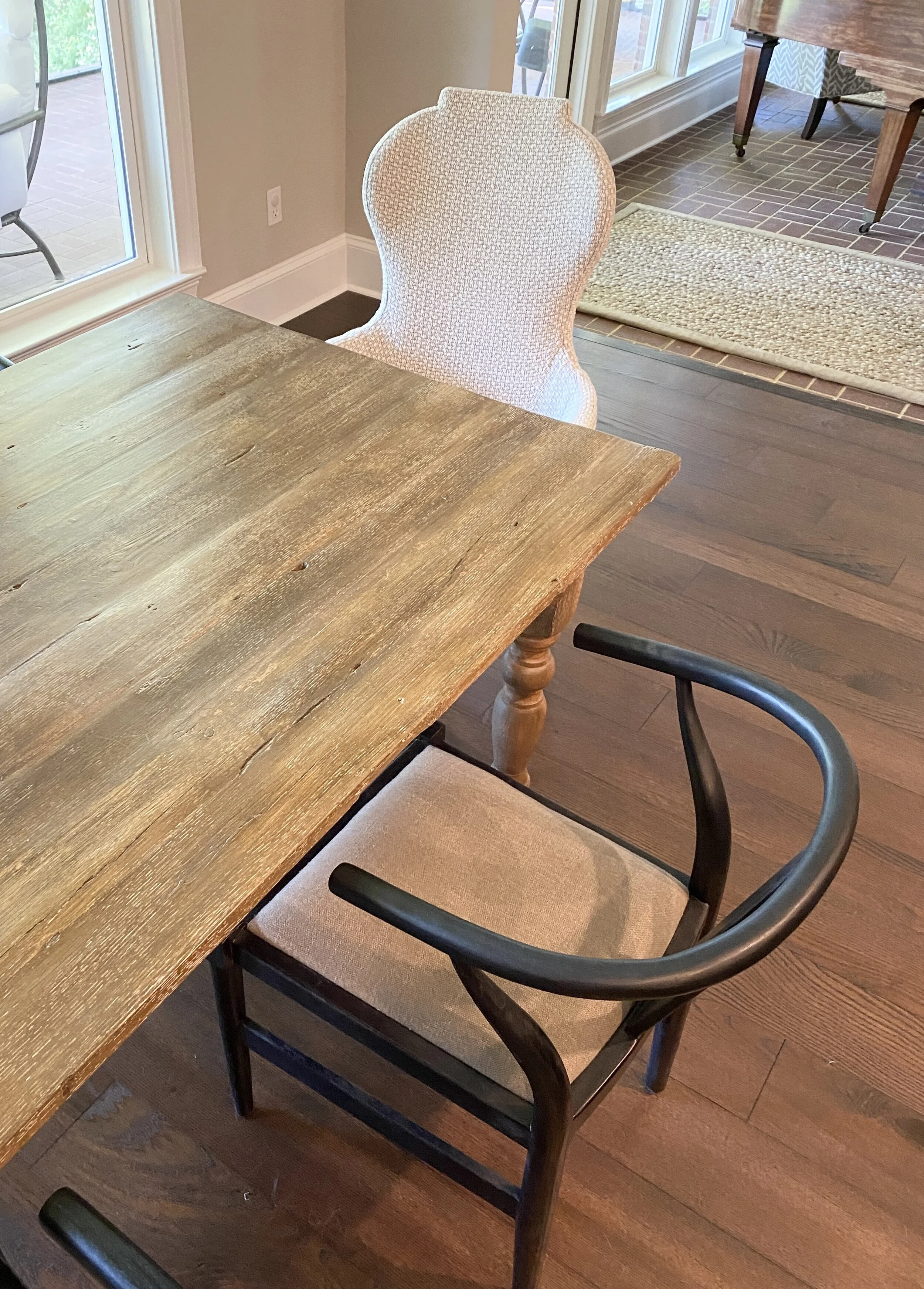
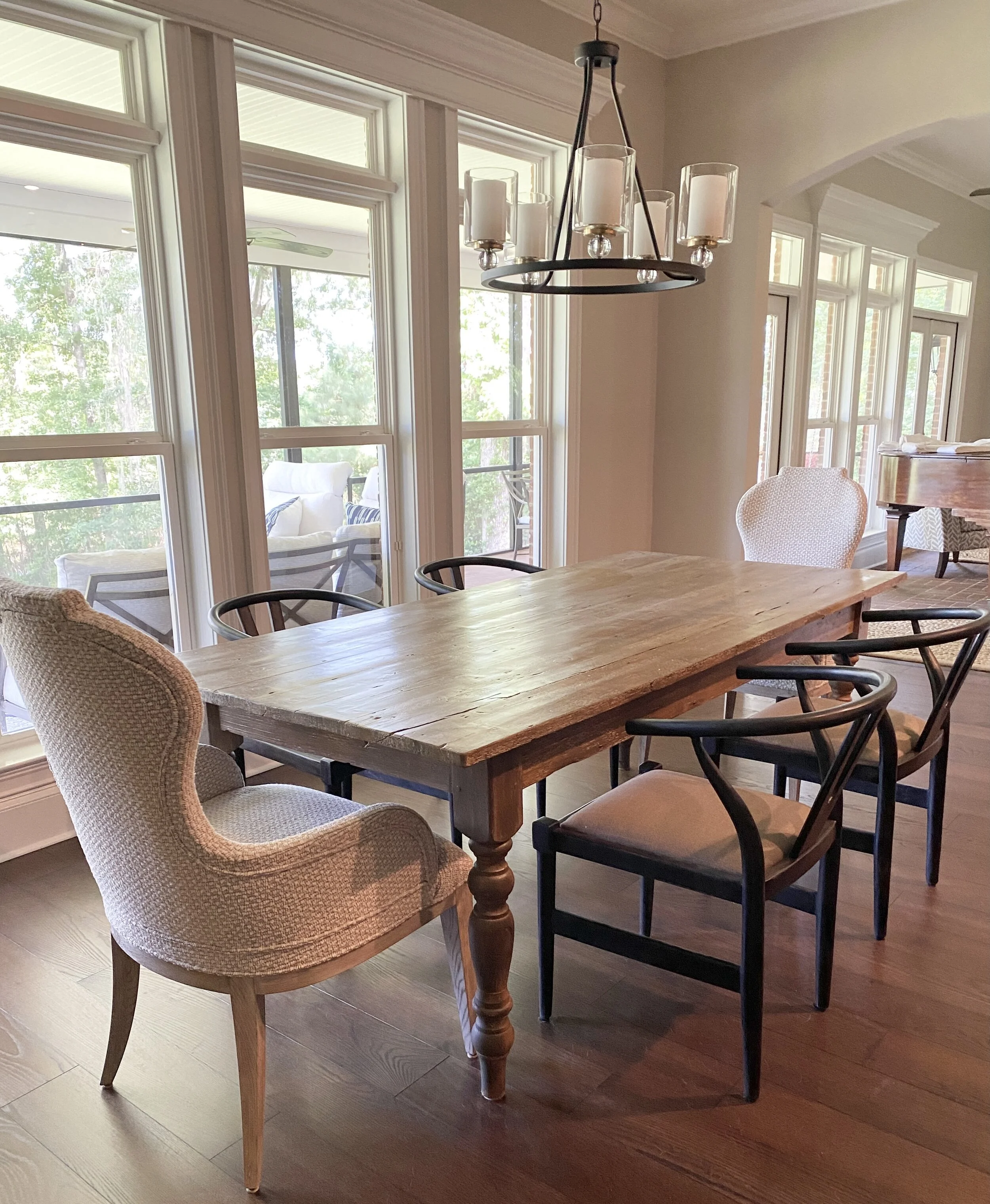
The breakfast room needed a little bit of a refresh and we were happy to oblige. My clients had a table they wanted to use, so we gave it a brand new finish and added a fun mix of chairs.
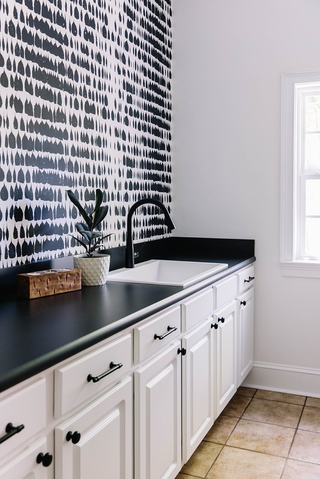
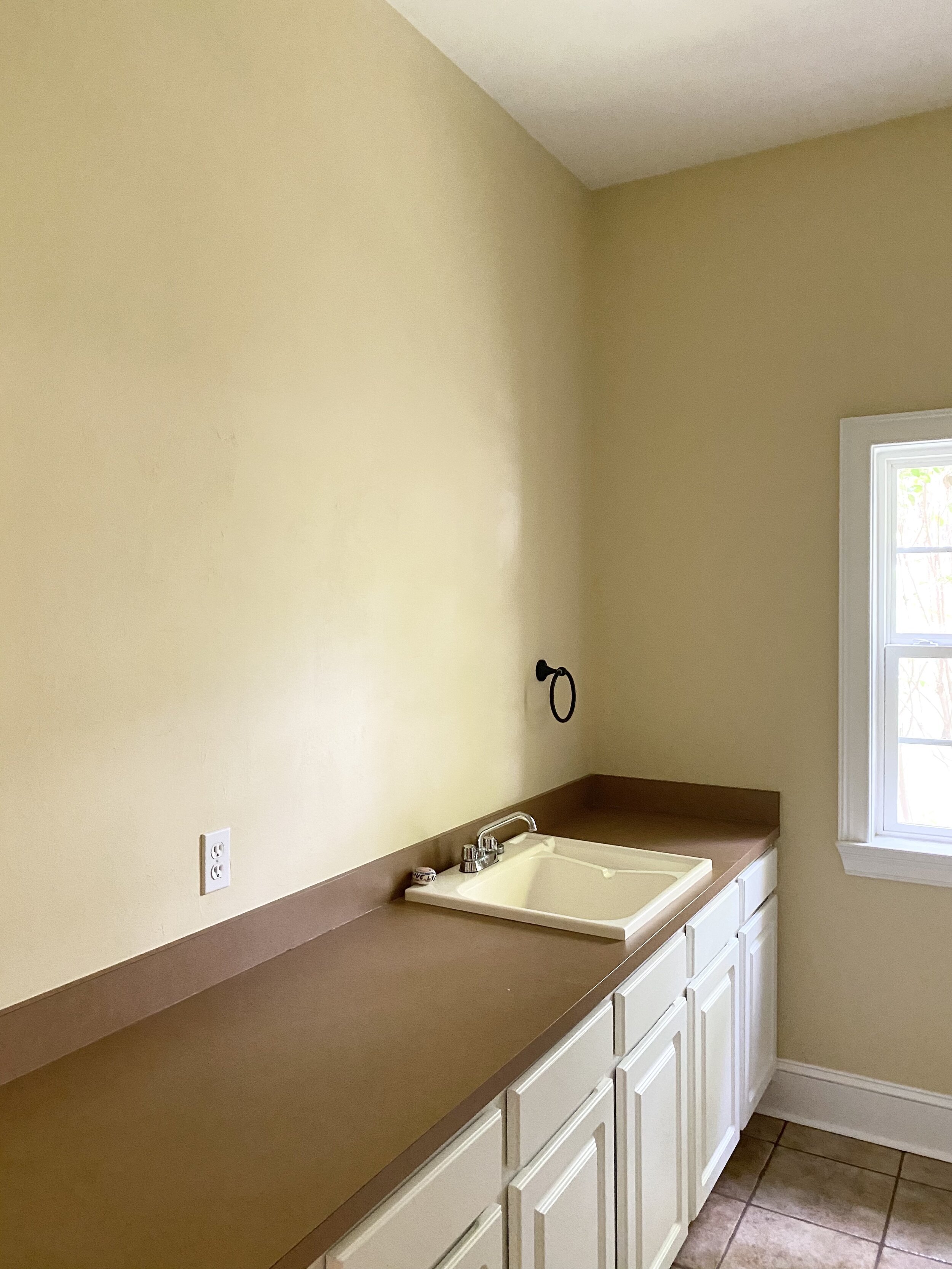
Finally, I have to show you the laundry room as this wallpaper is one of my favorites! I’m usually not one to do an accent wall, but this one turned out better than I hoped. In addition to the wallpaper and paint, we replaced the counter, sink, faucet and added cabinet hardware to keep the black and white theme going.
What a project, right? I am incredibly thankful for the opportunity to work on this project and create a home like no other for these clients.
Thanks for Reading!
Jennifer

