Let’s Design a Dining Room
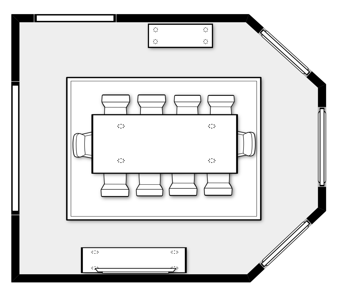
Back in November, I wrote the first post in this series called Let’s Design a Family Room. Today, I’m walking you through the steps of how I design a dining room. Always start with furniture plan. For dining rooms, the shape of the space determines what table will work best. If the room is more of a square, a round table works best and if it’s a rectangle shape, then a rectangle table works best. For today’s post, I’m using a rectangle table since that’s the most common.
In addition to a table and chairs, think about the other pieces you can work into your furniture plan. For storage, you can use a china cabinet or buffet. 20 years ago, everyone had a china cabinet with their wedding china prominently displayed. Today, most dining rooms I design just have a buffet with something pretty hanging above. This gives you a surface for serving as well as accessories. Here’s a furniture plan I designed for a client with a large amount of space. In addition to the buffet, we included a bar cabinet for the other wall.
Once you’ve determined the best size table, let’s start with bringing in some color! Dining rooms are filled with casegoods (aka wood furniture) so there’s very little opportunity to bring in color. For this room, I’m giving it some much needed personality by adding wallpaper and a beautiful blue rug. For the draperies, I kept them neutral with a pretty blue trim detail along the edge.
Most dining room chairs come standard with a neutral upholstery fabric, so the blue rug gives a lot of contrast. The cushions are usually very easy to change the fabric, so don’t be afraid to reupholster.
I’m a big fan of mixing wood finishes so everything isn’t so “matchy matchy”. I found this great chair from Ballard Designs and mixed it with a dark wood table. Since your dining room furniture isn’t used very often, stay classic so you’re not ready to replace it in a few years. If you’re going to be trendy, do that with your lighting.
I have two strong opinions about lighting over a table. The size is important and most people tend to go too small. 27” to 33” wide is a good place to start, but it all depends on the width of your table and height of your ceiling. The installation height is also VERY important. I recommend 32” to 36” of space between the bottom of your light and tabletop.
When mixing wood finishes, it’s best to keep 2 of the 3 items the same finish. For this dining room, the table and buffet are the same dark finish. I love this beautiful mirror from Arhaus for above the buffet to tie in with the lighter color of the chairs.
What do you think? I’d love to hear your thoughts in the comments. Now, if you need some advice for your own dining room, then let’s talk. My virtual consultation is a one-on-one “strategy session” where I can help you figure out the best steps to start your own project. We can talk furniture plans, I can recommend places to shop or answer any specific question you might have. I only accept a limited number of these consultations, so reach out to today to schedule.
Thanks for Reading!
Jennifer


