Kids come with too much stuff!
I'm working on a project where I've been asked to design three spaces that we all use on a daily basis - especially if you have kids! A laundry room, drop station and kid's playroom.
I have one son (he's 9 and amazing) and what he brings through the door each day is mind boggling...jacket, backpack, lunchbox, a toy he found in the cushions of the car, etc. He walks right by the super cute hooks I installed by the garage door and heads for the kitchen with all his stuff. Then, the papers start to come out of his backpack and fills the counter. What's a mom to do with all that CRAP?!?
My current solution is a drawer dedicated to his school supplies, a large tray on the counter to hold all the forms, newsletters and mail I need to keep and a recycling bin in the pantry for all the paper. But now, back to my client. Here are some great inspiration photos I found for the new spaces I'm working on.
 |
|
| Creating storage under the washer and dryer is a great idea. Looks so much better than the pedestals you can purchase from the appliance manufacturer. (Photo Source) |
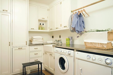 |
| Utilizing the corner in this laundry room is genius and would be a great idea for my client. We wouldn't get as much space on the left wall, but definitely an idea worth pursuing. (Photo Source) |
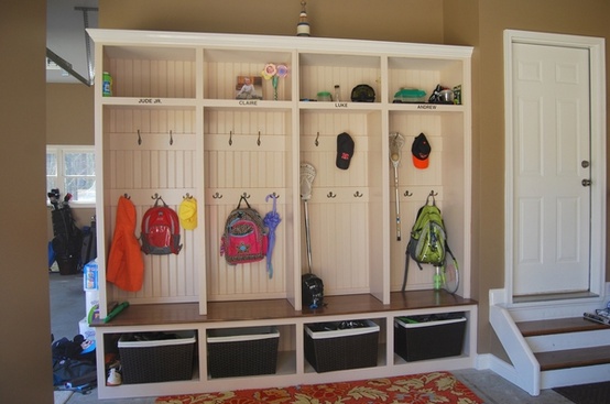 |
| What a great idea of putting lockers in the garage. This is the place most people have the room to spare. I also really like this layout. A top shelf for things you don't need every day, two rows of hooks and a large basket at the bottom for shoes. (Photo Source) |
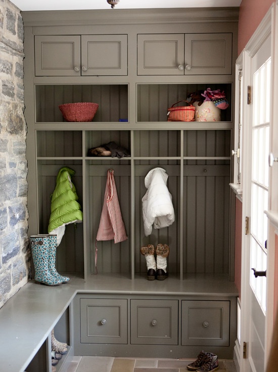 |
| Another corner arrangement, but this time it's at the back door. I'm a big fan of this layout and really like the deep drawers along the bottom and the extended seat. (Photo Source) |
 |
| I really like this idea of a corner desk for the kid's playroom. When space is tight, you should definitely take advantage of a corner. (Photo Source) |
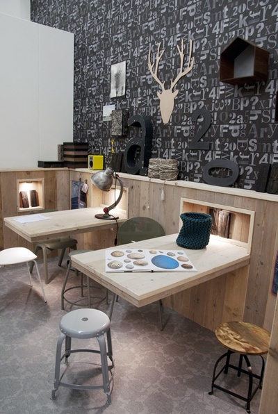 |
| This is a perfect solution when you need more than one desk space. Instead of everything lined up against the wall, you come out into the room with the desks. Suddenly you can utilize all three sides. (Photo Source) |
 |
| These desks have so many wonderful things happening. The cork boards, the layout and the lights...love it all! I'm even smitten with the blue door. (Photo Source) |
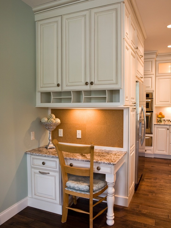 |
| By using a leg, instead of a side panel, this desk space feels more open. I really like this for my project. Plus, the cork board on the wall is very smart! (Photo Source) |
I promise to update you on the final products as I go through the designing process. I've already started some cabinetry elevations that I promise to share, but I need to show them to my client first.
If you need help getting organized, give me a call!
Thanks for reading,
Jennifer

