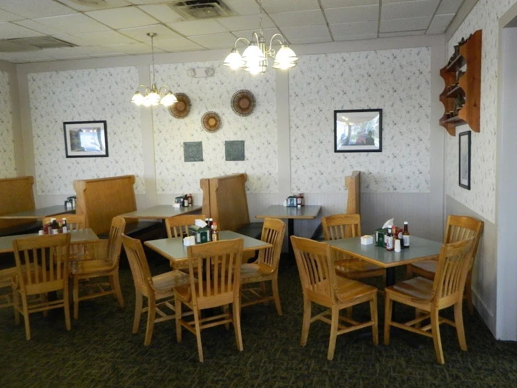
I've been working on a few restaurant projects this summer and thought I would share some photos with my readers. Both of the restaurants are owned by the same company and they needed some inexpensive updates to the decor. Both are also located in small, southern towns and were full of oak finished furniture and bead board - which I couldn't change. I decided to use a theme of "modern country", which I'm pretty sure I made up.
We agreed that removing the existing wallpaper would be done first, then paint, then wall decor. I'm amazed at the difference those few changes made to the overall feel of the space. Now, I wait patiently until we can change out flooring, furniture, light fixtures, upholstery, etc....
 |
| BEFORE...not much I can say here, but "help!" |
 |
| AFTER...not only did we remove the wallpaper and paint the walls, we also painted all the ceiling tiles black. That made a huge difference. The art I used are actually enlarged photos stretched onto canvas. I love the simplicity of them. |
 |
| Another way I used photos was by purchasing these ready-made frames from Target and then inserting colorful photos of rural images. A modern twist on country! |
 |
| I find myself grimacing as I write this, but I did use a NASCAR theme in the back banquet room. This restaurant is located in a small Georgia town and they love racing! This was one of the arrangements I created using inexpensive items. I ordered the poster online and found the ready-made frame at Hobby Lobby. Because all the posters were different sizes, I had them make all the mats to give them a more custom look. The plate was one they already had, I just had our painter spray it black. Kind of looks like a tire... |
 |
| BEFORE...yawn! |
 |
| AFTER...as you can see I kept most everything that was originally there, but added the utensil prints (only $20 each) and colorful accessories to the shelf. The wallpaper was still up when I installed these, but now it's been painted. |
 |
| BEFORE...this is the other side of the same room. All the pieces looked so small. These guys were really enjoying their dinner! |
 |
| AFTER...by replacing the smaller pieces on the end with over sized barn photos, it made all the difference. I also changed out the plates in the existing holder. |
 |
| There wasn't much I could do to this eyesore, but I will say the future plans involve a lot of drywall! I found some unique containers at the local antique store and filled them with artificial wildflowers. |
 |
| Another inexpensive idea I did was using these Pier 1 plates in an organized grouping. A traditional item used in a modern way! |
|
I've hesitated on whether I wanted to post these because I don't feel like they best represent what I can do as a designer, but what it does show is I can do good work in any conditions. I was given a lot of parameters, which not only included using what was already there, but spending VERY LITTLE money in VERY LITTLE time. I honestly felt I was on an episode of Restaurant Impossible. I'm excited to continue my work with these clients and create a final product we are both proud of!
 |
| A little sneak peak at the new fabric we're putting on the booth cushions. |
Thanks for reading!
Jennifer


